Owner & Founder
Date Published: 8/26/2026
Website design, it’s like trying to bake a soufflé while blindfolded. One wrong move, and poof, it’s a hot mess. But hey, no pressure! As a website designer, you’re the magician behind the curtain, crafting digital experiences that (hopefully) don’t make people want to throw their devices out the window. The challenge? Balancing beauty and brains.
Because while a gorgeous website might get a second glance, it’s not worth much if it runs slower than your grandma’s dial up connection or navigates like a maze designed by someone who hates humanity. It’s your job to create a website that’s as functional as it is fabulous, something that doesn’t make users want to file a formal complaint to the internet gods. Think of it as digital matchmaking: pairing clean aesthetics with seamless usability. And trust me, when your design gets it right, people notice. When it doesn’t? Well, they’ll notice that too, but not in the way you want.
Here’s the deal: if your website isn’t mobile friendly, you’re basically handing potential visitors a reason to ghost you. People don’t just prefer websites that work on their phones, they demand it, with the same energy a toddler demands snacks. So, if your site doesn’t fit nicely on a tiny screen, you might as well put up a sign that says, “Sorry, we don’t do modern.”
Test your site on every device you can get your hands on, smartphones, tablets, that one guy’s ancient iPod Touch, because your goal is to make sure no one has to squint, pinch, or scroll sideways like they’re trying to crack a safe. And for the love of Wi-Fi, keep your buttons thumb friendly! If someone accidentally clicks the wrong thing because your buttons are smaller than a flea’s foot, they’re not sticking around. Let’s make the internet a little less frustrating, shall we?
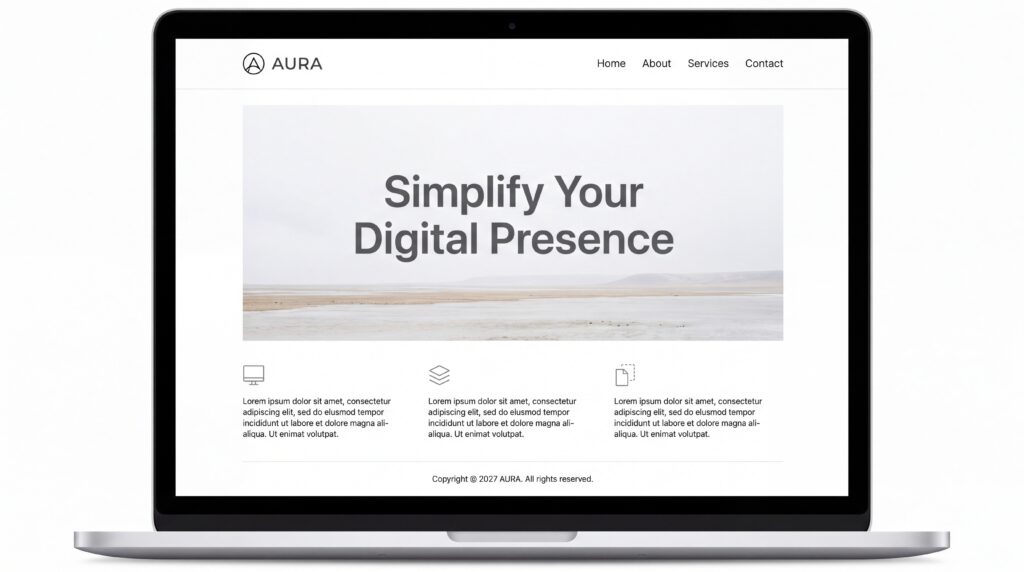
Minimalism in web design isn’t just a trend; it’s practically a religion at this point. If your website looks like it’s hoarding fonts, colors, and pop-ups like they’re going out of style, it’s time for an intervention. Think of your layout like a party, you don’t need every single guest you’ve ever met showing up. You just need the ones who won’t spill red wine on the carpet.
Start by choosing a color palette that doesn’t make people question your sanity. A few complementary colors can go a long way; there’s a reason no one’s painting their living room neon green and magenta. The same goes for fonts. Two or three max, okay? This isn’t an all you can use typography buffet.
And then there’s white space, your new best friend. It’s not “wasted space,” Karen, it’s breathing room for your content. Let your visuals and text shine without competing for attention like kids at a talent show.
Finally, skip the temptation to cram in every widget and animation you can find. Just because you can add a bouncing GIF to your homepage doesn’t mean you should. Your visitors came to find information or buy something, not to relive the Myspace days. Keep it classy, not cluttered.
Let’s talk navigation, the unsung hero of web design. Think of it like your website’s tour guide. A good one shows visitors around, cracks a few jokes, and makes sure no one gets lost in the gift shop. A bad one? Well, they’d leave you stranded in the middle of nowhere with no map and a dying phone battery. Don’t be that guy.
Start with a menu that doesn’t require a PhD to understand. Nobody wants to play “Where’s Waldo?” just to find your About page. Keep it clear, concise, and, most importantly, functional. Pro content creation tip: stick to common terms like “Home” or “Contact.” If you get too creative and rename it something like “The Mothership,” congratulations, you’re now the only one who knows what it means.
Dropdown menus? Use them sparingly. They’re like cilantro, some people love them, some people think they ruin everything, so don’t overdo it. Oh, and please make sure your links actually lead somewhere. There’s nothing worse than clicking on a link only to find out it’s as empty as your willpower on cheat day.
Finally, give breadcrumbs a shot. No, not the kind you toss to ducks, the digital kind that shows users where they are. It’s navigation, not a scavenger hunt.
Speed matters, people. If your website takes longer to load than it does for a toddler to put on shoes, you’re basically begging visitors to hit the back button. And no, they won’t come back. Start by tackling those massive image files, yes, I’m talking about the 5MB “artistic” photo of a coffee cup you uploaded. Compress it. Better yet, use next-gen formats like WebP, which is fancy talk for “fast and fabulous.”
Next up, ditch the unnecessary code. Your CSS and JavaScript files don’t need to look like the unedited first draft of a novel. Minify them. Streamline them. Think of it as spring cleaning, but for your website. And for crying out loud, enable browser caching. If your visitors are coming back (and they will, because you’re awesome), don’t make them reload every single file like it’s Groundhog Day.
Finally, embrace lazy loading like it’s your new best friend. Let images and videos load only when someone scrolls to them, instead of dumping everything onto their screen at once. It’s like serving dinner course by course instead of piling the table with food, classy and efficient. And hey, no one ever complained about a website that loaded too fast.
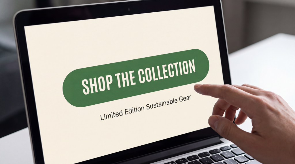
Look, a good call to action (CTA) isn’t some shy little suggestion hiding in the corner, hoping someone notices it. It’s bold, it’s loud, and it practically screams, “Click me, you know you want to!” Your CTA buttons should stand out like the one extrovert at a party, bright colors, big fonts, and an energy that’s impossible to ignore. Think less “polite invitation” and more “overly enthusiastic game show host.”
Now, let’s talk language. Skip the boring “Submit” or “Learn More.” This isn’t a DMV application; it’s your website! Use action packed phrases that make people feel like they’re missing out if they don’t click. “Get Started Now,” “Snag the Deal,” or even “Transform My Life”, go big or go home. And don’t forget to create a sense of urgency. Nothing motivates action like a little FOMO. “Limited Time Offer” or “Only a Few Left” might just be the nudge your visitors need to take the plunge.
Lastly, placement is key. CTAs buried at the bottom of your page are about as useful as a lifeguard at a kiddie pool. Put them front and center, where they can’t be missed. Make it easy, make it obvious, and watch the clicks roll in.
SEO isn’t rocket science, but it’s definitely not a walk in the park either. Think of it as a blind date, it’s setting your website for Google search, first impressions matter, and you’ve got to show up looking sharp. Start by sprinkling those primary keywords (like “Website Designer”, hint, hint) strategically throughout your content, but don’t overdo it. This isn’t a keyword stuffing competition; Google sees that and rolls its eyes.
Next, dive into your meta tags and descriptions. These little snippets are like your website’s Tinder bio, short, sweet, and convincing enough to get someone to click. And don’t even think about skipping alt text on your images. It’s not just there to impress search engines; it also helps with accessibility. Win-win.
Oh, and if you’ve got links, make them count. Internal links help visitors navigate your site, while external ones show Google that you hang out with the cool kids. Just don’t link to anything sketchy, it’s not worth the SEO side eye.
Finally, keep your URLs clean and readable. Nobody wants to click on “www.yourwebsite.com/xp9qz23$#@%.” If your URL looks like it came from a cat walking across a keyboard, fix it
Congratulations, you’ve made it to the end of this website designer rollercoaster, arms in the air, screaming included. Now that you’re armed with these tips, you’re basically a website wizard. Remember, good design is about balance. You’re not trying to create the Mona Lisa of websites, but you also don’t want something that looks like it crawled out of a 2005-time capsule.
Keep things user friendly, because nobody has time to decode a cryptic interface or wait three years for a page to load. Test, tweak, and then test again, it’s like folding a fitted sheet; it might take a few tries, but it’s worth it. And don’t get too attached to perfection; trends evolve faster than a high-quality social media content that is trending.
Most importantly, have fun with it! Your website is a reflection of you (or your brand), so let your personality shine through, unless your personality involves Comic Sans. In that case, we need to have a serious talk. So go ahead, build something brilliant, and remember, you’re not just designing a website; you’re crafting a first impression. Make it count!
For more information and website designer tips, be sure to read our following related articles. Also, don’t forget to check out our most asked website designer questions with answers about how to build an optimized clean and mobile friendly website below.
A mobile friendly website adapts seamlessly to different devices, offering users a smooth and enjoyable experience no matter how they access your site. This involves responsive design techniques that ensure content adjusts to various screen sizes and orientations. Features like touch friendly navigation and readable text are key to keeping visitors engaged.
Collaborating with a knowledgeable website designer can help you incorporate these elements effectively. Mobile friendly design isn’t just about appearance, it’s about functionality, accessibility, and creating a positive interaction for every visitor. By prioritizing these aspects, your site can better connect with its audience and support your business goals.
Finding the right website designer means looking for someone who not only has technical expertise but also understands your business’s goals. Review their portfolio to see if their design style aligns with your vision and check for experience in creating responsive, user-friendly sites.
Clear communication is key, choose a web designer who listens to your ideas and offers solutions tailored to your needs. A good designer will focus on features that enhance user experience, like intuitive layouts and seamless navigation, while also helping your website site stand out online. Don’t hesitate to ask about their process to ensure they’re the right fit.
Fast loading times, intuitive navigation, and clear call to action buttons are essential for keeping users engaged on mobile devices. Prioritizing simplicity in design ensures visitors can quickly find the information they need without frustration.
Optimized images and streamlined content help improve speed and usability, while features like clickable phone numbers and location-based services enhance convenience. Collaborating with a website designer who understands these elements can make all the difference in creating a site that delivers a seamless experience.
Effective design encourages visitors to take action by guiding them intuitively through your site. Strategic use of visual hierarchy, compelling headlines, and well-placed call to action buttons can help drive engagement. Clear, distraction free layouts and mobile friendly forms simplify the user experience, making it easier for visitors to complete desired actions.
Partnering with a skilled website designer ensures these elements are seamlessly integrated, creating a site that not only attracts visitors but also converts them into loyal customers.
Budget friendly tools like website builders, templates, and free design resources can help you create a polished, mobile optimized site without extensive expertise. Platforms with drag and drop interfaces simplify the process, letting you focus on creating user friendly designs. Integrating free or low-cost analytics tools allows you to track performance and adjust strategies as needed.
Additionally, many platforms offer tutorials and guides to help you navigate the process efficiently. These resources make professional quality websites accessible, even on a tight budget.